
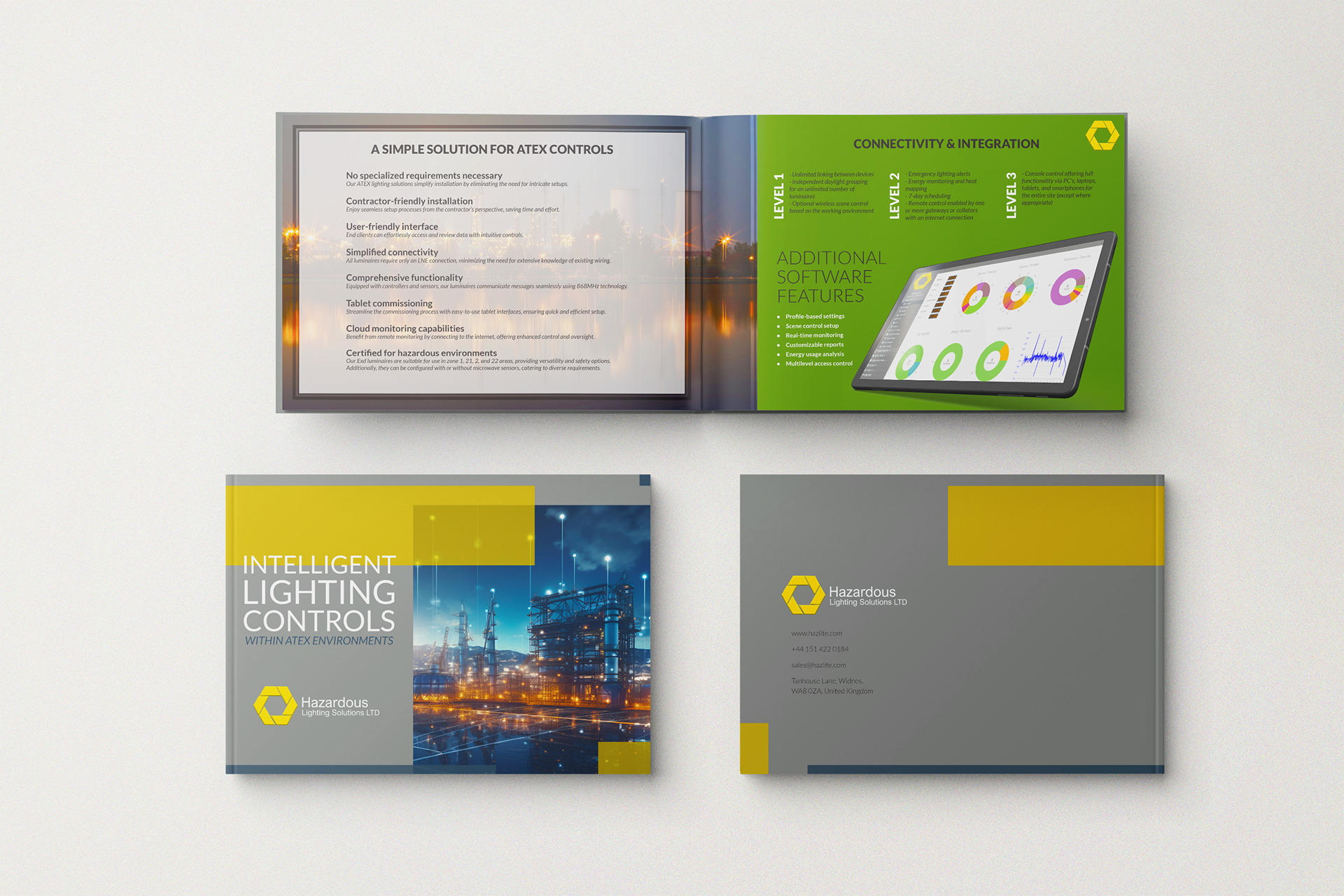
I designed a visually compelling and informative piece that aligns closely with the goals of my client, a hazardous lighting company. The design choices were driven by the need to present complex technical information in a way that was both accessible and engaging for trade show attendees.
Design Choices
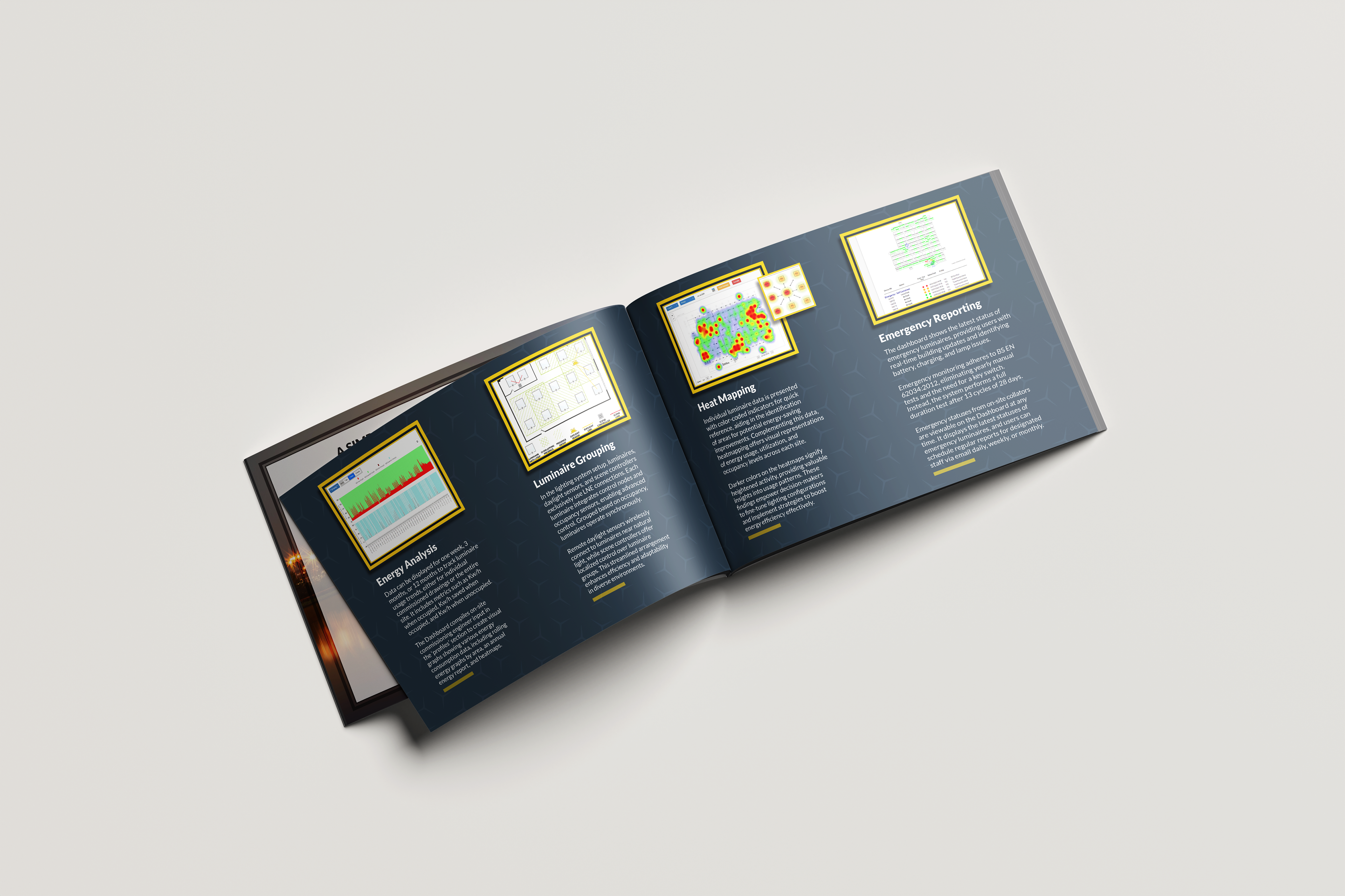
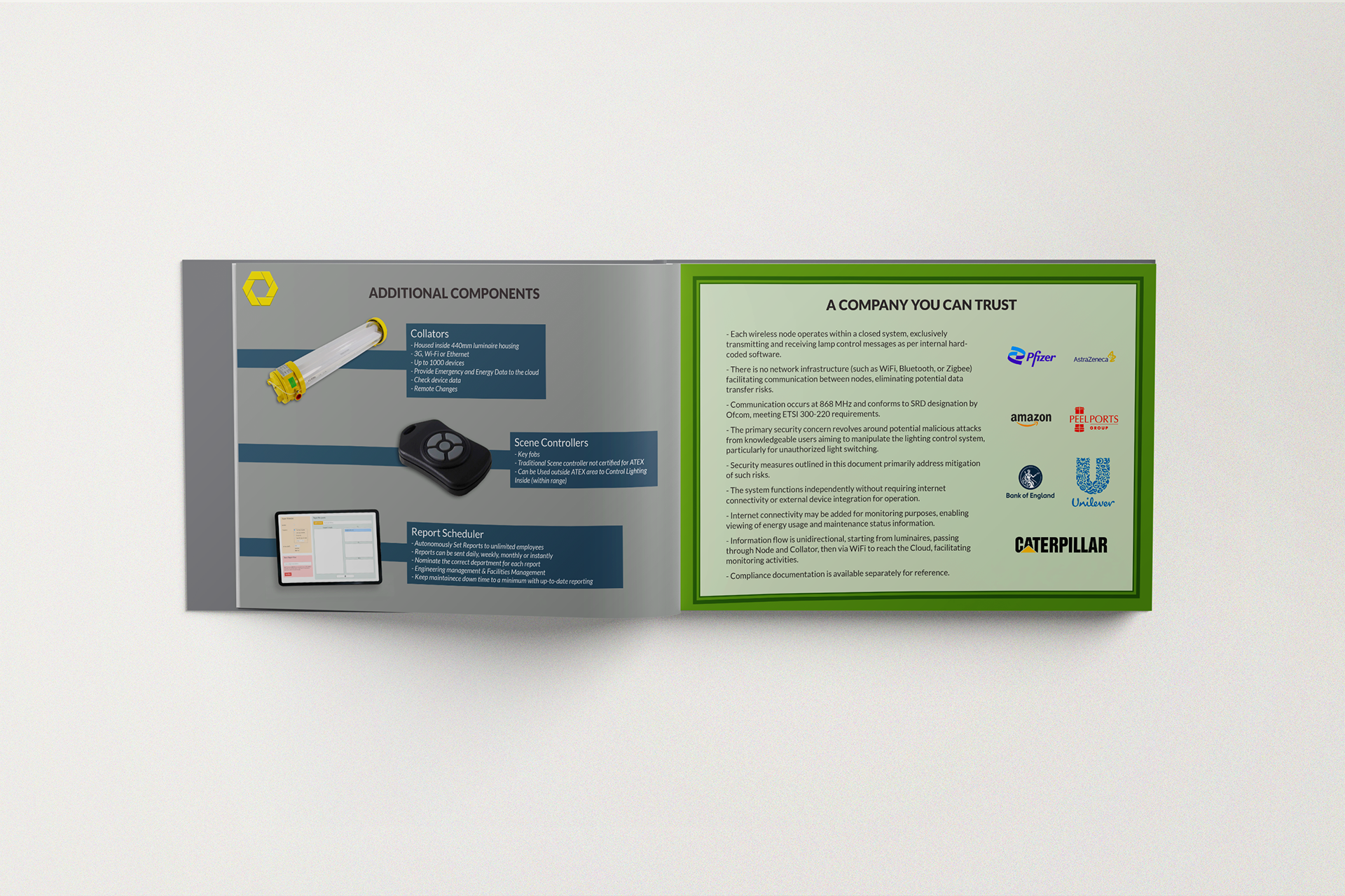
For this trade show booklet, I selected a professional color palette of blues and grays to reflect the technical nature of the products while conveying trust and reliability. The typography combines bold, sans-serif fonts for headings with easy-to-read serif fonts for body text, ensuring the detailed technical information is clear and accessible. I incorporated industrial-themed imagery to visually reinforce the technical content, and structured the layout with clear headings and subheadings, along with diagrams and data visualizations, to guide the reader through the material smoothly.
Impact
This booklet not only met the client's objective of showcasing their products effectively at the trade show but also helped to elevate their brand presence. By simplifying the presentation of complex information and making it visually appealing, the booklet played a key role in attracting and retaining the attention of potential customers, ultimately supporting the client's business goals at the event.
This project demonstrates my ability to create designs that are not only visually appealing but also highly functional, meeting both the aesthetic and practical needs of the client.